



Using checklists
Detail view & tasks
Clicking a checklist in the overview opens the detail view. It shows the progress, all metadata, and the tasks of the checklist.
Choosing a layout
The detail view is available in three layouts — which one is shown is a personal setting under Personalization → «Detail layout»:
- Side panel (default) — opens as a panel over the list view, ideal for a quick look
- Split — metadata on the left, tasks on the right, for working on both in parallel
- Full page — uses the full width, ideal for checklists with many tasks or fields
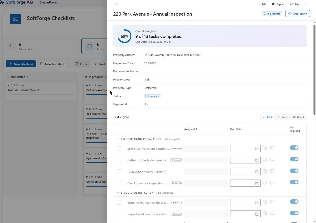
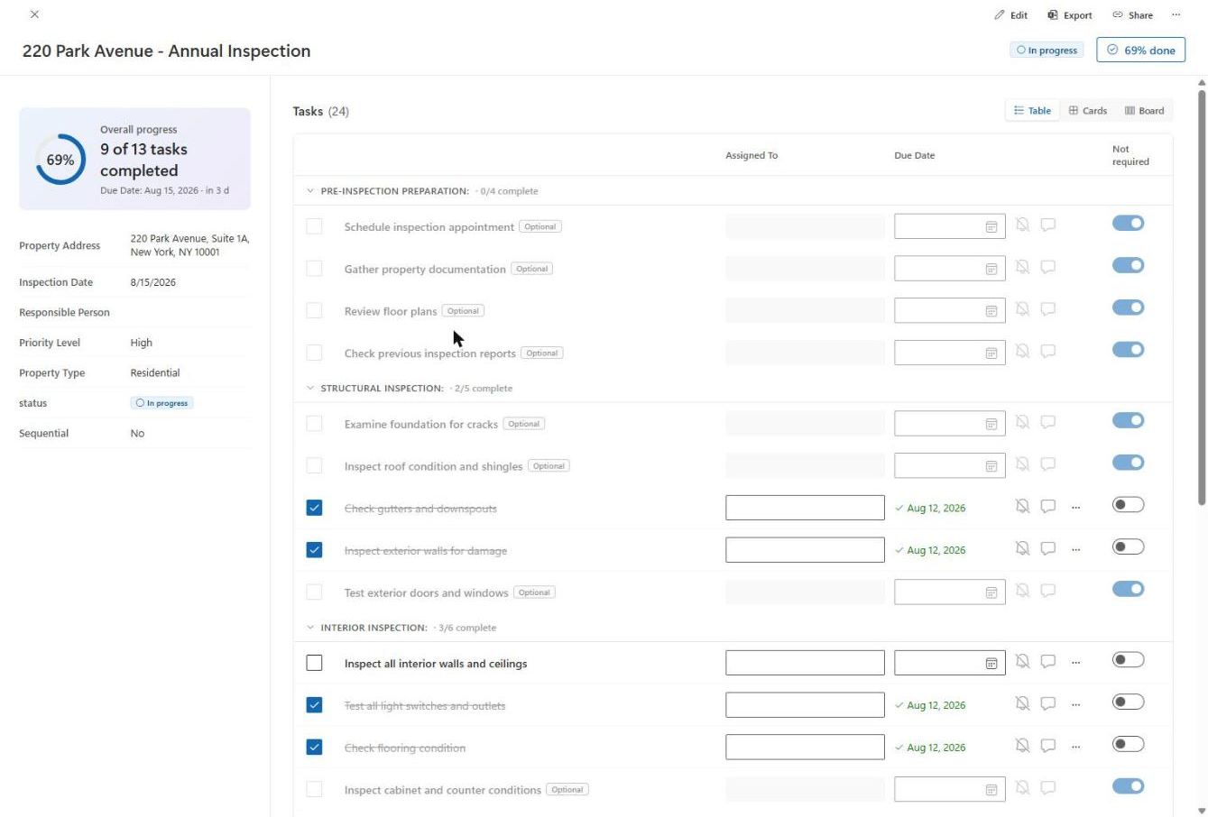
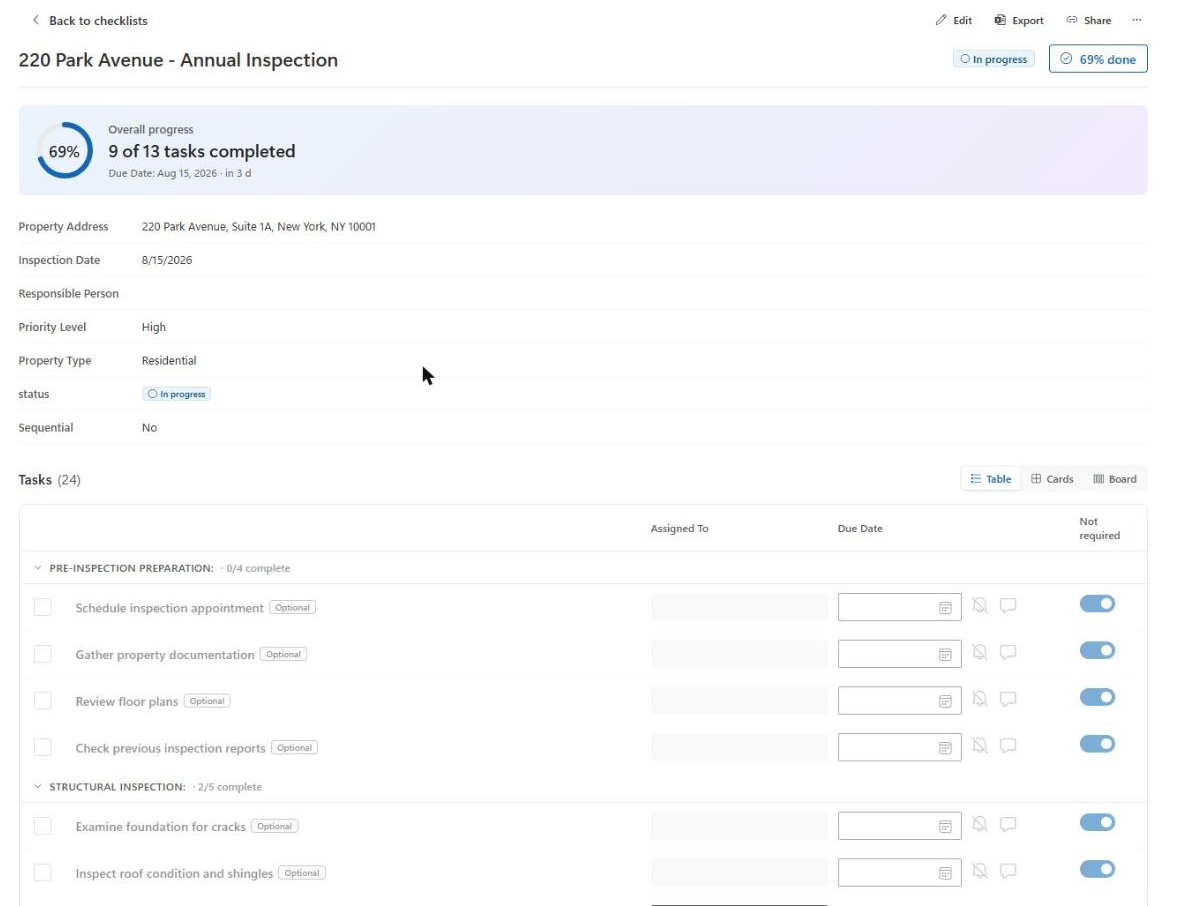
Header
The header provides:
- Edit details — opens the form with the title and metadata fields for editing
- Export — exports the checklist including all tasks and comments as an XLSX file (two worksheets: Checklist and Tasks)
- Share — copies the direct link to the checklist to the clipboard
- More actions («…») — Complete/Reactivate and Delete
- On the right of the title row: the current status, and a button that offers «Complete» directly once progress reaches 100%; before that, it shows the current percentage (also clickable, so you can complete the checklist before it's finished)
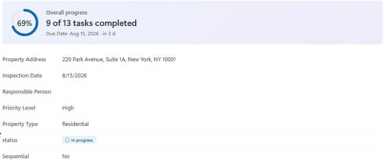
Progress card
A progress ring shows at a glance how many of the required tasks are already done. Below it, all metadata fields enabled on the template are listed, followed by the status and whether the checklist is sequential.
Tasks: three views
Just like the list overview, tasks can be displayed in three views — switchable directly above the task list, also available as a personal default under Personalization → «Task layout»:
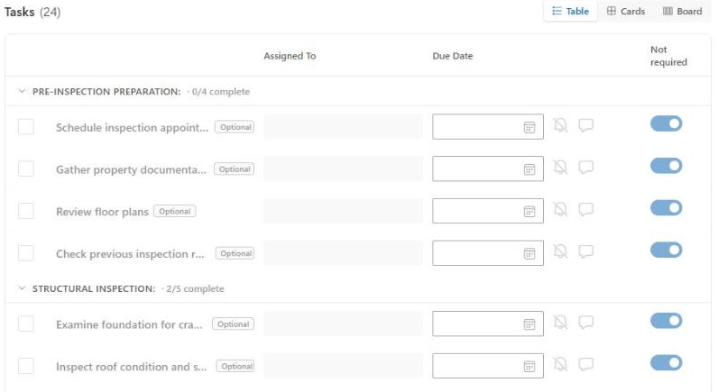
Table
Shows, per task, the checkbox to complete it, the title (with a lock icon for locked tasks), the assigned person (directly editable via a people picker), the due date (directly editable, shown in red when overdue), the info icons (see below), and the «Not required» toggle.
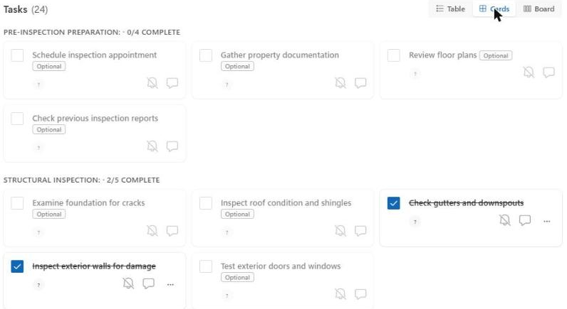
Cards
Each task appears as its own card with a checkbox, title, description (if entered), the assigned person, and the info icons.
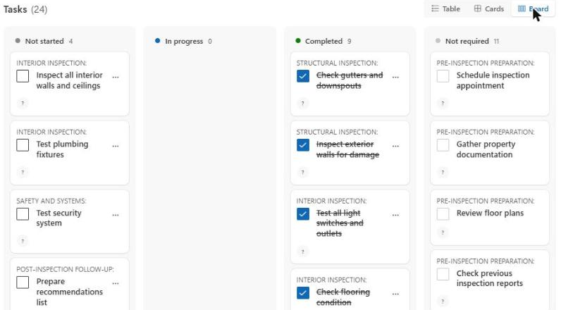
Kanban
Tasks are shown in four columns: Not started, In progress, Completed, and Not required. Drag a card into another column to change its status — or use the «Set status» menu on the card instead. You cannot drag a card into the «Not required» column; locked (sequential) tasks cannot be set to «Completed» while the previous required task is still open.
Changing status
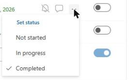
A task's status («Not started», «In progress», «Completed») can be set directly in any view via the «Set status» menu (the «…» icon on the row or card) — in the Kanban view, also via drag & drop. If a task is not required or locked, «Completed» is disabled in the menu.
Sequential checklists
If a checklist is based on a sequential template, tasks unlock one after another: a task can only be started once all preceding tasks are completed or marked «not required». Locked tasks are marked with a lock icon, and their checkbox is disabled.
Note
Task groups (the «Group by» field) are displayed in the order the tasks were entered in the template — not alphabetically. This keeps the first group of a sequential checklist (e.g. «Before handover») on top.
Info icons per task
- Poke — sends an email notification to the assigned person. The icon has three states: greyed out if no person is assigned or the task is not required; a bell icon if it has never been poked; a filled bell icon with a tooltip (date and the person who poked it) once it has been poked.
- Comments — opens a panel with the task's comments, sorted chronologically, newest first. If comments already exist, the icon is shown filled.
- Info — shows the task's description (from the template), if any.
Completing and reactivating a checklist
Use «Complete» (header or context menu) to mark the checklist as done — even if not all tasks are completed yet. Completed checklists can no longer be edited and disappear from the overview by default (statistics tile «Active»). Use «Reactivate» in the header menu to reopen a completed checklist for editing.
Deleting a checklist
The «…» menu in the header, or the context menu in the list view, lets you delete the entire checklist including all its tasks. This action must be confirmed.